eeg_visualization
Module: missions.nodes.visualization.eeg_visualization
Visualization of time series based on EEG signals to combine it with mapping to real sensor positions
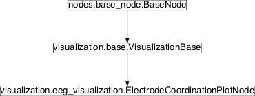
Inheritance diagram for pySPACE.missions.nodes.visualization.eeg_visualization:

ElectrodeCoordinationPlotNode
-
class
pySPACE.missions.nodes.visualization.eeg_visualization.ElectrodeCoordinationPlotNode(clip=False, contourlines=False, limits=False, nose_ears=False, smooth_corners=False, add_info=False, single_plot=False, figlabels=False, figtitle=None, **kwargs)[source]¶ Bases:
pySPACE.missions.nodes.visualization.base.VisualizationBaseNode for plotting EEG time series as topographies.
This node uses time series data and plots snapshots of the activity in the brain, i.e. in the electrode configuration space. The node inherits the functionality of the VisualisationBase.
Therefore, see documentation of
VisualisationBaseto view basic functionality.Parameters
Layout Options: contourlines: If set to True, contour lines are added to the plot.
(optional, default: False)
nose_ears: Mark nose as triangle and ears as bars (common for EEG plots)
(optional, default: False)
smooth_corners: If true, the generated graphics will be rectangular, i.e., the corners around the round head shape are filled. This is achieved by adding sham electrodes to the corners, who’s signals are calculated as the means of neighboring electrodes.
Note
This is only for visualization purposes and does not reflect the true data! Be careful with use in scientific publications!
(optional, default: False)
add_info: If set to True, additional information (e.g. number of trial) is displayed.
(optional, default: False)
figlabels: If this option is True, channel names and channel coordinates.
(optional, default: False)
figtitle: The title that is displayed. If None, the class name is used.
(optional, default: None)
single_plot: All results per window are plotted into one figure with columns being classes and rows being time points.
(optional, default: False)
Influence the way how the data is plotted: clip: If set to True, the values are clipped to maximum and minimum defined by parameter limits. This is only working if limits are defined.
(optional, default: False)
limits: Here, the user can set the limits for the color in the contour plot (e.g. [-1.0,1.0]). If this option is not set, the colorbar is normalized according to the data.
(optional, default: False)
Exemplary Call
-
    node : Time_Series_Source
-
     node : Electrode_Coordination_Plot
     parameters :
          figlabels : True
          create_movie : True
          time_stamps : [200, 400]
          timeshift : -200
          smooth_corners : False
-
     node: Nil_Sink
Here is an alternative call:
-
    node : Electrode_Coordination_Plot
    parameters :
         single_trial : True
         accum_avg : True
         separate_training_and_test : True
         add_info : True
         time_stamps : [400]
         limit2class : Target
Author: Sirko Straube (sirko.straube@dfki.de) Date of Last Revision: 2013/01/01 POSSIBLE NODE NAMES: - ElectrodeCoordinationPlot
- ElectrodeCoordinationPlotNode
- Electrode_Coordination_Plot
POSSIBLE INPUT TYPES: - TimeSeries
Class Components Summary
_compute_levels([limits])_plotValues(values, plot_label, fig_num[, ...])_smooth_corners(x, y, z, data, ...)Add sham electrodes to the corners of the coordinate system input_types-
input_types= ['TimeSeries']
-
__init__(clip=False, contourlines=False, limits=False, nose_ears=False, smooth_corners=False, add_info=False, single_plot=False, figlabels=False, figtitle=None, **kwargs)[source]
